- Gender
- Age
- Class
- Ethnicity
- Sexuality
- Nationality
- Disability
Gender
Magazines often use sex to sell their products, as a result of this they will present the cover with an attractive model of either a male or female that maybe wearing limited clothing or in a provocative pose. In 1975, Laura Mulvey came up with the theory that women were presented as objects of desire to sell products. This theory has become outdated as genders are more equalised now as evident by magazines showing pictures of topless men to sell them.

This magazine clearly supports 'Laura Mulvey's' theory as she presented on the magazine topless, this represents the theme of sex which they use to try and help sell the magazine. The fact that she has a 'flat stomach' could be used to influence what a women should aim to look and suggests to women what their 'perfect' body should look like.
These links show how woman and men can be represented in different ways through the media:

This magazine goes against 'Laura Mulvey's' theory as there is a man being represented to the reader topless, however in this particular magazine it is aimed towards men, therefore this means they may be encouraged to buy the magazine due to wanting to look like him. Again, this may give men the stereotypical body image that they should, even though realsitically not everyone has the time to achieve such a look.
Age
In 1904 Stanley Hall came up with the theory that the 'common state' of teenagers was depression, that criminal activities increased between the ages of 12 to 24 and that young people crave excitement, therefore they find it in sex, drink or drugs.
Although everyone knows that this is not common for all teenagers and they are not all depressed, people still play on the idea of this so they are able to sell magazines based on the rebellious theme.

This magazines tries to represent this theme by the colour of his hair suggesting he is 'out of control' and the bold, worn out font gives the magazine a rough finish, this could relate to the crime of vandalism to also link back to Stanley's theory. This particular magazine does support Stanley's theory and uses it to it's advantage, although not all teenagers will want to buy or be interested in reading about this, therefore another company came up with a magazine named 'top of the pops' which represents Hebdige's theory of youths having fun causing a bit of trouble.

Due to people realising that his theory is not completely true, in 1998 Bill Osgerby realised that since then the media's potrayal on youth hasn't changed very much as it isn't hard to find negative situations which involve them, including crime, violence and sexual licence. Although, in 1988 Dick Hebdige figured that Stanley's theory was too extreme and came to a new thoery that youth is fun but does involve them to be a bit of a 'troublemaker'.
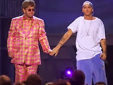
Class
The fact that celebrities featured on magazines are generally going to be quite wealthy due to their success they can be made out to be 'poor' simply becuase this may help the target audience to relate to them. This is supported by Keith Gandal's theory in 2007, as he states that the lower class are considered to be a 'cultural other', deviating from the middle to upper class. In 1998, Medhurst came up with the theory that the celebrites are not like us(assuming that we are of middle class), they try and appear to be more poor and edgey instead of the stereotypical middle class. By using Medhurst's and Marxist's theory they say that it can give the working class a negative image as they appear to be prone to; unemployment, un-realiability, drinking and involved in criminal behaviour. This is also linked to the theory by Richard Butsch in 1992, who states that within the media males that are in the working class as presnted as, "Incompetent and ineffectual, often a buffoon, well-intentioned but dumb. In almost all working-class series, the male is flawed, some more than others...he fails in his role as a father and husband, is lovable but not respected."
This is also proven to be true by other medias, such as in 'the simpsons' Homer ticks all the boxes that are involved in his theory.
Medhurst's theory is also proved to be true by the stereotypical 'rock and roll' image where there is cheating, drinking and drugs present, this is evident on magaizne covers such as the one below:

This magazine uses this image so young males and females of the working class see them as 'human' therefore can relate to it.
A completely different appearance of the celebrites is shown by the use of Hip-Hop magazines where it is stereotypical to emphasise the wealth of the feautured artists. A typical star may be shown off with an expensive car, cigar with lots of money around them. This can influence people to buy the magazine due to the fact that they are interested in how the stars became like that and where they started of as. This could relate to Keith Gandal's theory, which states about the rags to riches story. Although, through the image of Hip-Hop it seems that they achieve their wealth by crime and drugs etc. this could result into the target audience relating this to the race of the person featured on the cover, as Stanley Hall claimed in 1981, blacks where stereotyped as the 'social problem' and the Hip-Hop theme embraces this.

Ethnicity
In 1992, Pieterse claimed that, “The legacy of several hundred years of western expansion and hegemony, manifested in racism and exoticism, continues to be recycled in western culture in the stereotypical images of non-western cultures.”
Another theorist Sarita Malik, 1998, states that due to the fact that white has been naturlized, it has been to considered to be the 'soical norm' and that white people are used more within the British media. An example of this is within the magazine 'top of the pops';

As clearly shown from the above, within this british media hardly any people of black ethnicty are featured. Malik came up with a suggestion that the reason there was a bias amount of white people on the images was due to the fact that not enough people from different races are involved in creating the media text. The fact that a lot of the UK magazines involve white people featured on their covers, such as on NME, Top of the Pops and Vogue this supports Malik's suggestion.
However due to the simple fact that on Hip-Hop magazines the person featured on the front is being potrayed as a 'criminal' this results in the negative stereotypes being emphasised, therefore Staurt Hall in 1981 came up with the idea that "There is a grammar of race based on a traditional diet for the British Media that is based on the standard image of blackness being the social problem."
The reason to why the embrace the negative image is also related to why the rock magazines initiate the theory by Stanley Hall in 1904 to be true.
Sexuality
In 1993, Dyer came up a claim that, “How we are seen determines in part how we are treated; how we treat others on how we see them; such seeing comes from representation”. Andy Medhurst came up with a similar idea due to the fact that sexuality is considered to be invisible, therefore the way one presents themselves can reflect on what others may think of them.
Throughout media sexuality is represnted differently, but within TV programmes gay men are often represented as 'ditsy' and 'feminine', this is very bias and inaccurate because it is clear that not all gay men will act in that certain way. The images presented on some rock and indie magazines are quite metrosexual as shown by the men wearing make up, such as eyeliner as this is not considered to be a stereotypical image of a heterosexual male.

“Stereotyping becomes ideological the moment it stops being simply a method of description and becomes a vehicle for values: the image of the screaming queen does not just mean ‘all gay men are like that’, it means ‘all gay men are like that and aren’t they awful’, which in turn means ‘and they are awful because the are not like us.”
This shows a negative impact on the homosexuals as they are discriminated for not being able to fit in with social 'norm' which again links back to Sarita Malik's theory on race in 1998.
More recently I think that there is less discrimination against homosexuals, although still isn't considered to be 'normal' compared with others simply due to the fact that it is different it seems to be more accepted.
Nationality
In 1998, a theorist Andrew Higson came up with the quote; “Identity is generally understood to be the shared identity of naturalized inhabitants of a particular political-geographic space – this can be a particular nation or region.”
This is often represented on different media TV programmes such as, Britains got Talent. However, is also highlighted on a few magazines to represent where they are from. An example of this is of the magazine cover for Kerrang below;

This is based clearly around the United Jack flag to represnt it's nationality.
DisabilityThroughout the media disabilites are presented in different ways, however within magazines there aren't very many disabled people featured. This could be considered to be bias as they are discriminated from them, for example if I search google images for magaizine covers for vogue this is what I would find;

Although, you could argue that within this search they are presenting the reader with close up shots for many of them, therefore as a result of this they cannot tell whether they have a form of disabilty or not, however many people would assume they didn't so again they fit in with the 'socail norm'.
Within some TV programmes they do include disabled people, such as in Glee, however the fact that there is a bias amount of people without a disability could result in them to feel slightly discriminated within the media.


